
NS – Persimmon, or a Color That Never Needed Me
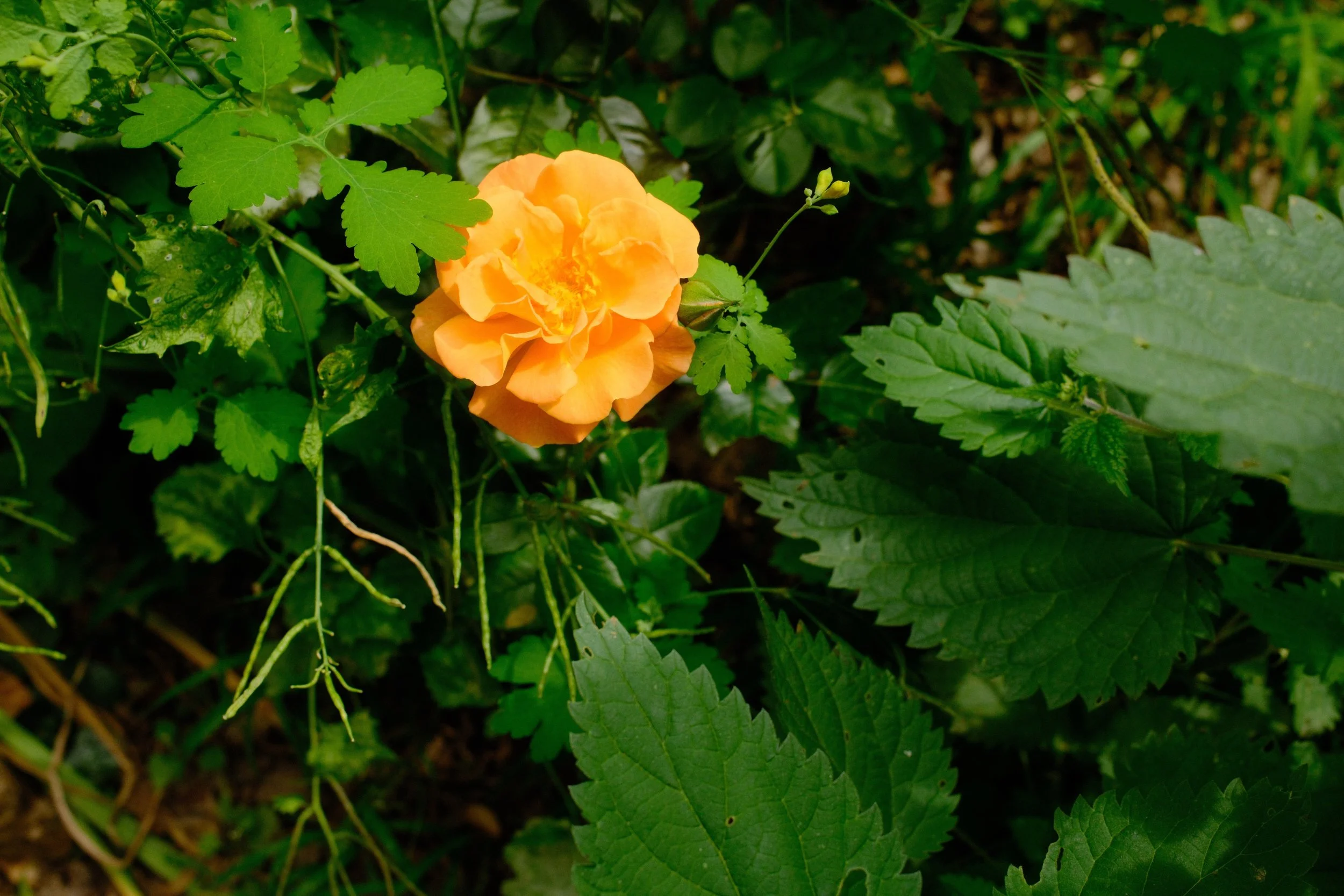
Orange rose growing among nettles, in the Tiergarten.
A Color Already There
Since NS – Bleu de faïence, something has been lingering in my reading: the history of ceramic colors. Not methodical research, more a curiosity that keeps coming back, a tab reopened in the evening. It was by following that thread that I stumbled on persimmon — not the color of a fruit, but that of a glaze — a shade ceramics has known for a long time, under names that aren't mine.
NS – Céladon came to me from a cup in Hamburg. NS – Bleu de faïence, from a door in Chefchaouen that Najat sent me, a hand resting on the white ceramic archway. Both times, an encounter had come before the recipe. Not this time. NS – Persimmon didn't need anyone to exist. It already existed, elsewhere, before I opened the first tab.
There's something a little funny about building a recipe around a color I know from books rather than from sight. Persimmon shows up at Skarkos, on the Greek island of Ios, in Early Cycladic II ceramics dated to roughly 2700 to 2300 BCE. I've never seen Greece except in photos. The same orange returns in Japan's Kaki glazes, centuries later, under a name that also happens to designate the fruit itself. Two distinct histories, the same color running between them, and me having traveled to neither.
Third Entry in the Nothing Selected Line
This is the third recipe in the NS family. Nostalgic Neg. for NS – Céladon, Pro Neg Hi for NS – Bleu de faïence: two simulations the CW series doesn't use. NS – Persimmon reaches for Velvia, another one CW leaves out, despite its star status among many Fujifilm photographers. What remained to be seen was what it would do with such a precise orange.
The test itself resembles neither of the previous two. Not a trip lived with the recipe in hand, like NS – Céladon. Not an assembly of already-familiar files, like NS – Bleu de faïence. Rather, a trip already lived, already photographed — the one behind NS – Céladon — reread after the fact through X Raw Studio, with a color that didn't yet exist at the time it was lived. A döner sandwich, photographed in Berlin long before the recipe existed, gives a first sense of what Velvia does with this particular orange.
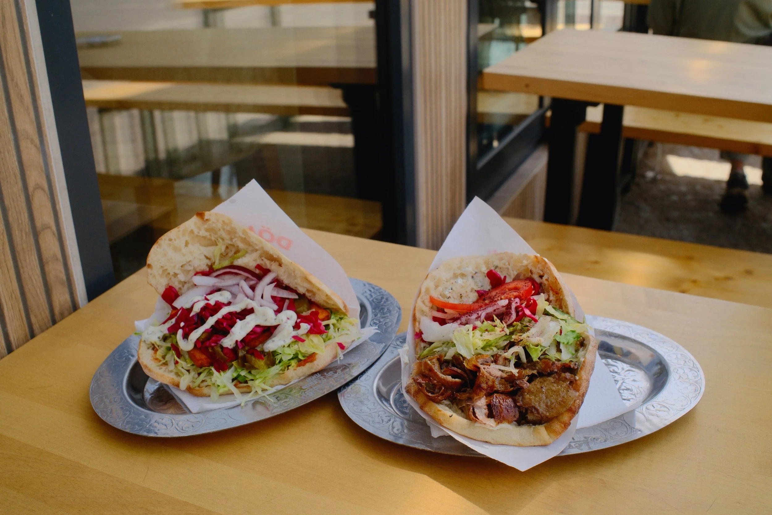
Two döner sandwiches, in Berlin.
Building NS – Persimmon
The starting point, a white balance shift of R -2 / B -5, was a working hypothesis rather than a considered choice. I tested it on fifteen SOOC photos: neutral surfaces, skin tones, and warm surfaces. RGB measurements revealed a marked green cast, and skin tone, measured at 63 degrees, fell into an unhealthy yellow-green.
Corrected to R +3 / B -3, a new round of measurements confirmed the shift: sky and skin nearly neutral, the oranges converging on persimmon itself (#EC5800). A trade-off was accepted on foliage saturation, less rich than with the starting setting, to preserve what mattered more: skin tones and sky.
This time, the presence or absence of the K&F Black Mist 1/8 filter affects two settings rather than one: Clarity, as usual, but also Sharpness.
| Parameter | Value |
| Film Simulation | Velvia |
| Dynamic Range | DR400 |
| Grain Effect | Weak / Small |
| Color Chrome Effect | Strong |
| Color Chrome FX Blue | Off |
| Highlight | –2 |
| Shadow | –1 |
| Color | –2 |
| Sharpness | –2 with Black Mist 1/8 filter / –1 without filter |
| Clarity | 0 with Black Mist 1/8 filter / –3 without filter |
| Noise Reduction | –4 |
| White Balance | Daylight |
| WB Shift | R +3 / B –3 |
| Exposure Compensation | +1/3 to +2/3 EV |
The trade-off isn't distributed the same way depending on the filter. Without it, Clarity carries most of the softening the look needs, while Sharpness stays close to neutral so as not to sacrifice too much definition. With the filter, that load shifts: Clarity can return to zero, since the optical diffusion already does the work, and it's Sharpness that drops slightly instead, to keep Velvia — sharper-edged than Nostalgic Neg. or Pro Neg Hi on oranges — from rendering persimmon too brittle.
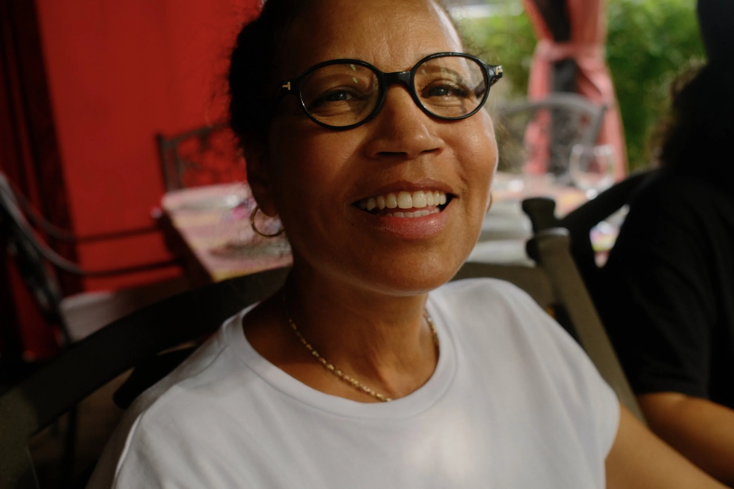
Najat, smiling, at home.
A face gives this story of RGB measurements more tangible proof than any number. Unlike the reread images from the trip, the portrait of my friend Najat, already seen on this blog through a door in Chefchaouen, isn't a retrospective read: it was shot live with that very first version of the recipe, the one that skewed green. I readjusted it once the correction was confirmed, so it would line up with the final version.
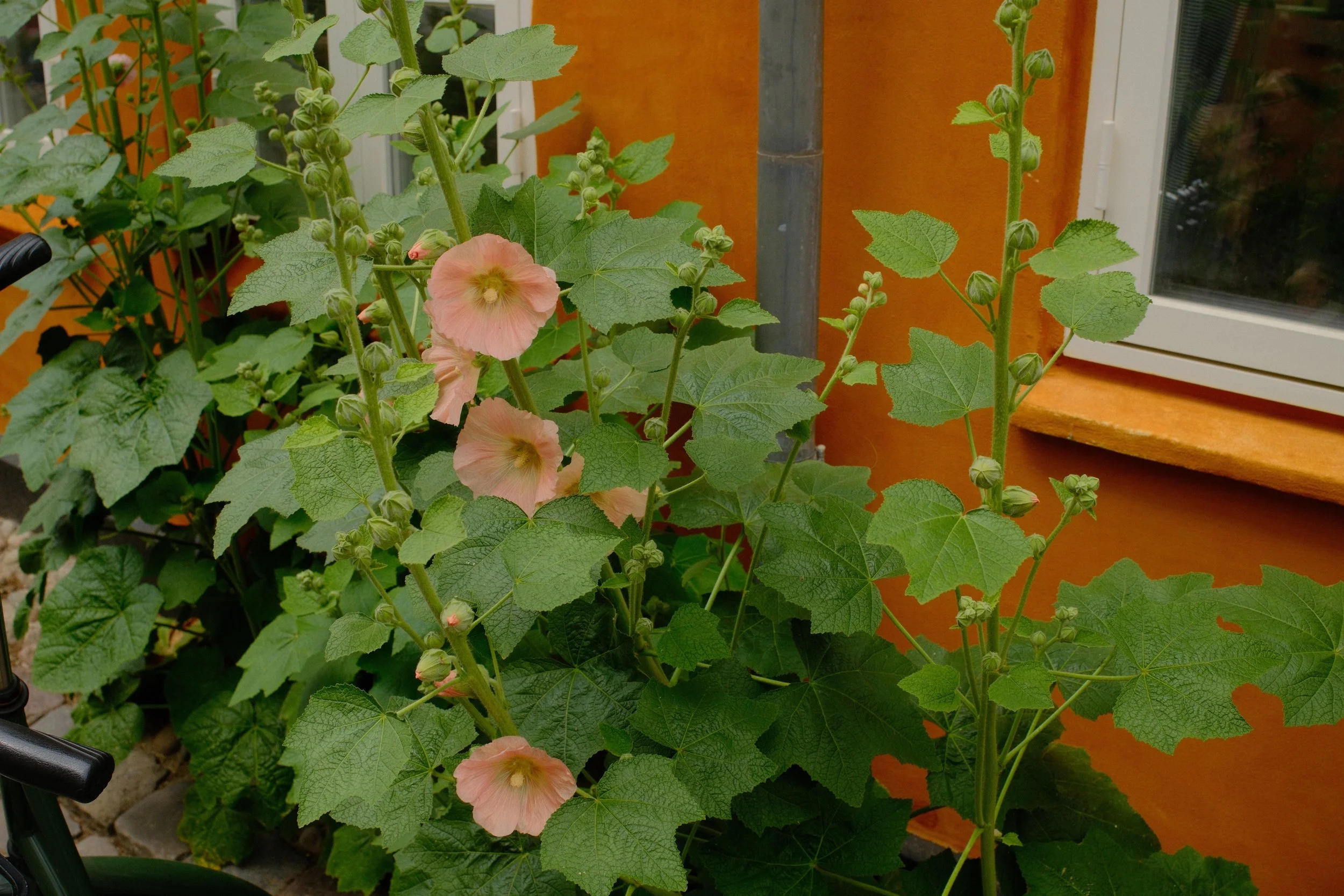
Hollyhock against an orange wall, at Aarhus C.
The Rest of the Trip
What remained were the images from Aarhus, the last stop of this reread trip. Aarhus C first, then the tables at La Cabra café, in the Ø district.
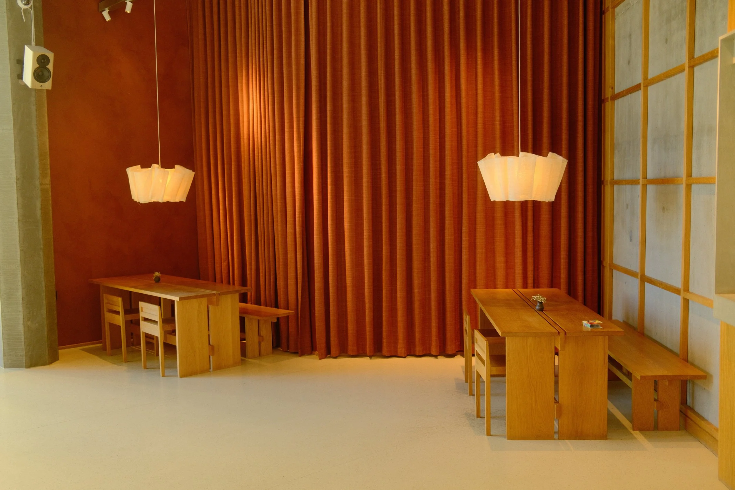
Wooden tables and benches at La Cabra, a specialty roaster, under an orange curtain, in the Ø district.
Three Recipes in the NS Family
The counter at Elbgold, a specialty roaster in Hamburg, closes this post on a face that never appears in my photos: the person making the coffee. It isn't the cup that launched NS – Céladon, left behind at a Copenhagen Coffee Lab location in Hamburg, found again later at another location in Copenhagen. It's simply another trade, crossed in passing, in a family of recipes that has never stopped borrowing from one: ceramics for Céladon and Bleu de faïence, roasting to close out Persimmon.
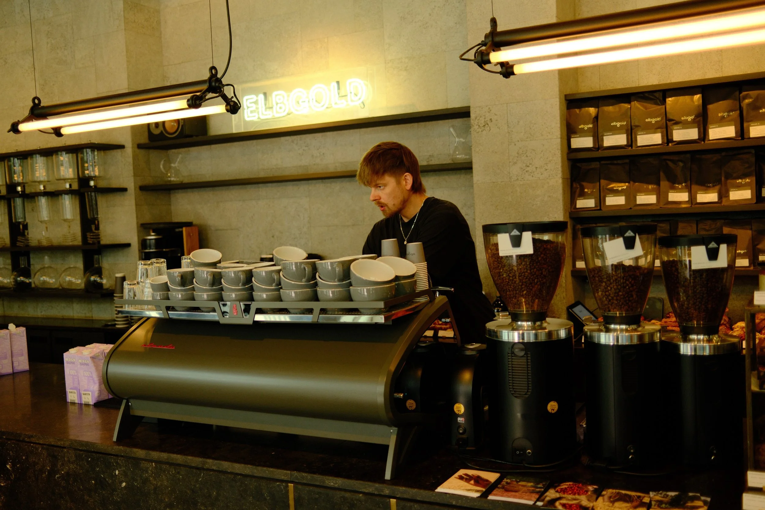
A barista prepares cups at the counter of Elbgold café.
Three recipes now make up the NS family. NS – Céladon and NS – Bleu de faïence each owed me an encounter. NS – Persimmon owed me nothing: it already existed, elsewhere, long before I took any interest in it.
If you try NS – Persimmon, write to me about what it does with your own photos. I read everything, and I reply.
— Louis-Martin Ouellet
All photographs in this post are SOOC — NS – Persimmon settings.