
NS - Bleu de faïence or Two Crafts for a Single Color
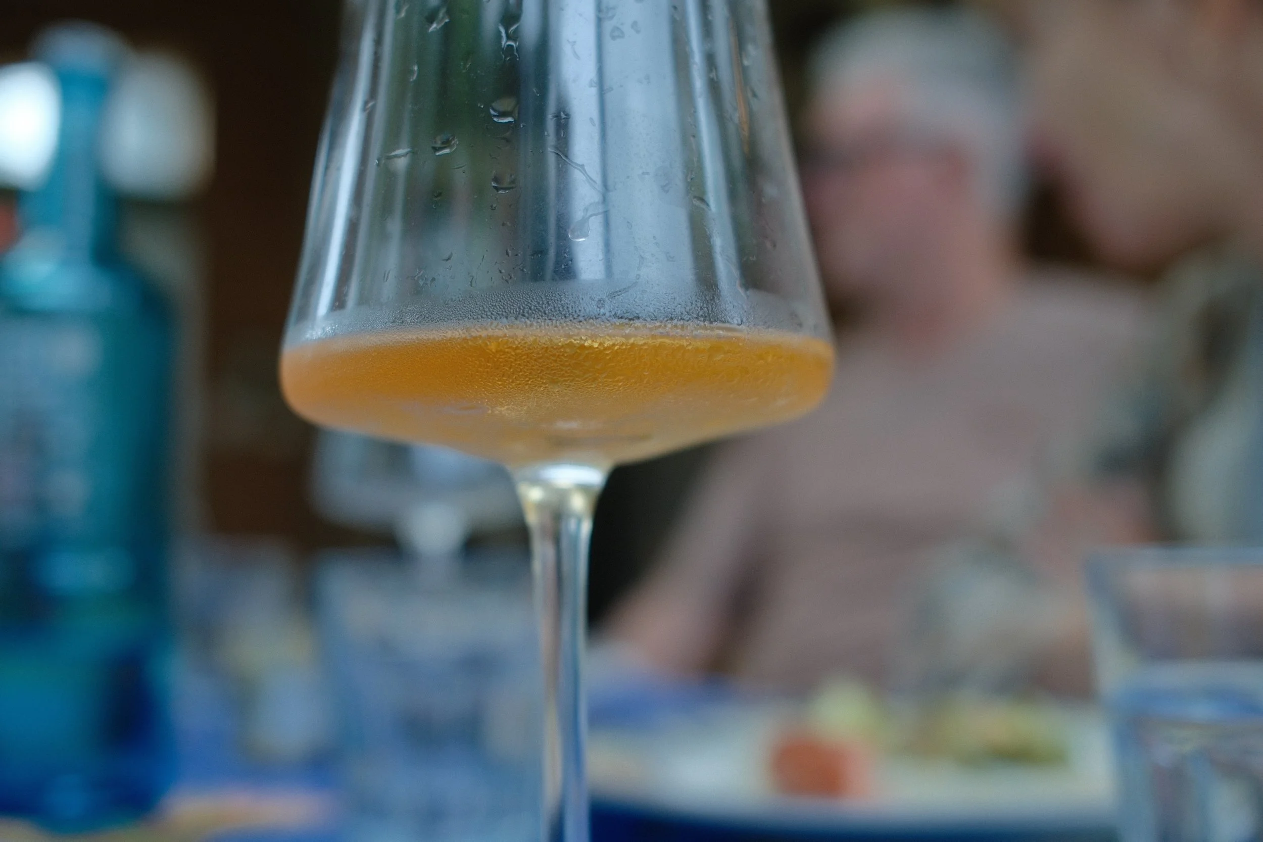
The blue, relegated to the bokeh, stays present without ever taking over.
The Color Before the Name
In Chefchaouen, Morocco's blue city, my friend Najat poses in a doorway, one hand resting on the carved white ceramic arch. The photo has been sitting in my files since she sent it to me, taken by a family member on her iPhone. It's what launched this recipe.
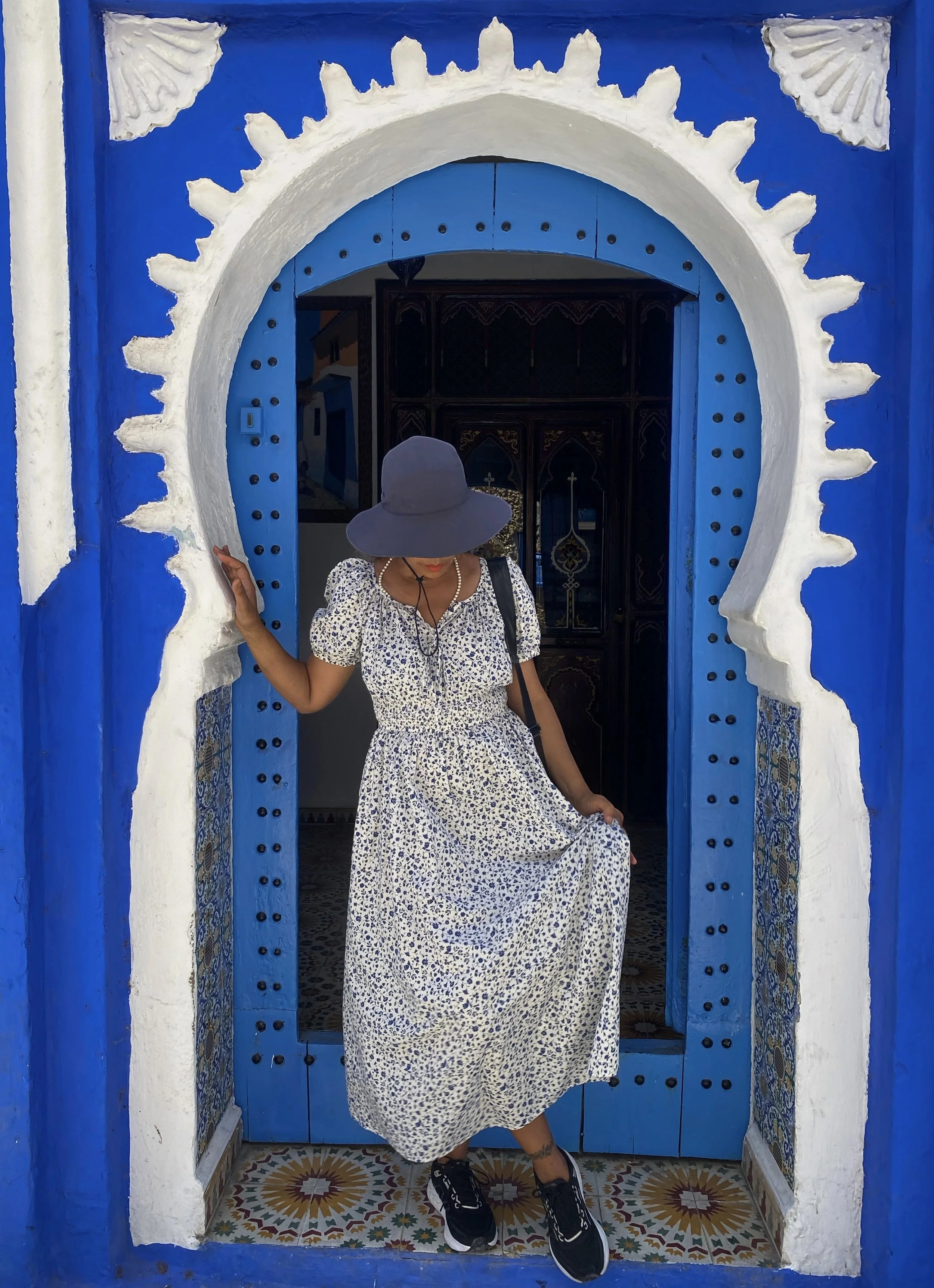
Najat, watching her step, with no idea she was about to walk into a future recipe.
That blue is saturated, unambiguous, already close to what's called faience blue in ceramics, nearer to cobalt than to turquoise. The name all but suggested itself. I could have called this recipe NS – Chefchaouen, but I wanted to keep the logic of names borrowed from ceramics, the same one behind NS – Céladon. The real work wasn't finding the name, it was taming the saturation of that blue so it wouldn't take over the image at the expense of skin tones.
Faience, like céladon: two ceramic words, not colors invented by photography, but borrowed from an older craft. I know that craft a little more closely than I thought. Marco has been my friend for more than forty years. He met Sylvie, his partner, fifteen years ago, so I've known her for that long too. For about five years now, since she took up ceramics during the pandemic, plates and bowls she's made have been turning up in my life without my giving it much thought.
At home, there are also turquoise blue cappuccino cups, an industrial object with no connection to her work. I've been noticing them more lately, as if the color itself had started showing up everywhere once I'd started seeing it.
I never made the connection to my photography. What happened was closer to the opposite: a cup in Hamburg, a particular energy I noticed in how a photo rendered, and the name NS – Céladon that came to me without my fully grasping its significance at the time. It wasn't until preparing NS – Bleu de faïence, setting it alongside NS – Céladon, that I understood what had happened. Five years of glimpsing Sylvie's work had left a trace that my photography eventually revealed, before I'd even talked to her about it.
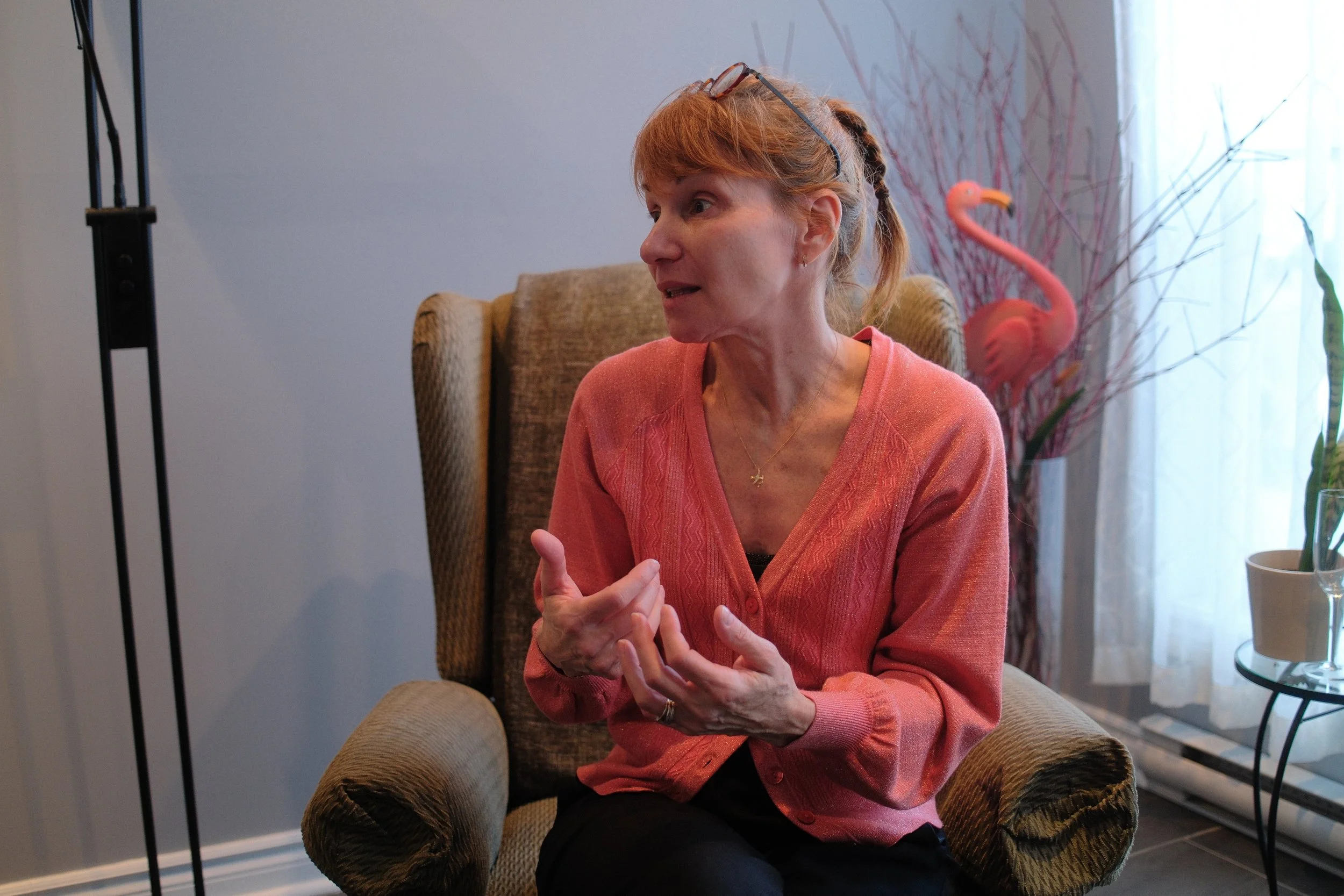
Sylvie, mid-conversation, the same hands that shape ceramics.
A Second Entry in the Nothing Selected Space
NS – Bleu de faïence is the second recipe in the NS family. If you're not familiar with this space or the logic behind it, I write about it in the post on NS – Céladon : seven personalized slots in the CW series, seven simulations already spoken for, and one spot left open for whatever the series couldn't cover.
NS – Céladon drew on Nostalgic Neg., a simulation absent from CW. NS – Bleu de faïence draws instead on Pro Neg Hi, a variant CW doesn't use either. Its cousin, Pro Neg Std, already carries the CW – Victor Séguin recipe in the closed series. Pro Neg Hi was still available, with its punchier contrast and different response to saturated colors, exactly what this blue needed.
Building NS – Bleu de faïence
The recipe wasn't born in one go. A first attempt, based on my understanding of the parameters, gave me a starting point. I then tested it against my catalogue of existing RAF files, photos I already know well, to see what it would do with them. What came out of it was too blue, and skin tones drifted toward red, especially indoors. That's where a rule asserts itself: a recipe should never distort the skin tones of a face, because a face shows up in the vast majority of photos we take. The practical consequence is simple: if faces come out badly, the recipe risks never being used, no matter how good the rest looks. That was the first constraint to satisfy in order to give shape to the original inspiration.
The starting point, a shift of R –1 / B +5, wasn't arbitrary. I had that saturated blue of the Chefchaouen door in mind, the one I mentioned at the start of this post, and I was looking for a setting that would capture its full intensity. It worked, for that color. But the same setting overwhelmed everything else in the image: shadows, neutral areas, even skin tones took on a cold, almost gray cast, on top of turning red under warm light, for lack of enough correction on the red. Optimizing for a single color was hurting all the others.
The move to R –3 / B +3 fixed both problems at once. Pulling the red back further, from –1 to –3, finished off the tendency for skin to turn pink. Bringing the blue down from +5 to +3 removed that generalized cold cast, while keeping enough blue that the color I was after stayed present, this time only where it belonged.
Quebec's summer greens called for a separate adjustment. Three versions were compared from the same RAF file: Color at +3, Color at +2, and Color at +2 with Color Chrome Effect off. It's this last combination that was kept. Color Chrome Effect, even at its lowest setting, added a density to the greens that didn't suit the light here.
This touches on something bigger than this one recipe. Most recipes circulating online are designed for the light of the southern United States, Europe, or Asia. Quebec has its own light, and summer here brings an abundance of green that needs to render well if the recipe is going to actually serve here. These regional adjustments come at a cost: a recipe optimized for Quebec light will necessarily be less versatile elsewhere. That's an accepted trade-off, not an oversight.
Clarity at 0 follows the same logic as with NS – Céladon. I keep a K&F Black Mist 1/8 filter on the X100vi almost permanently, which already introduces a slight diffusion in the highlights. Taking Clarity below zero would have been redundant. Without that filter, I'd recommend –2 instead.
Here are the full settings:
| Parameter | Value |
| Film simulation | Pro Neg Hi |
| Dynamic range | DR400 |
| Grain effect | Weak / Small |
| Color Chrome Effect | Off |
| Color Chrome FX Blue | Strong |
| Highlights | –2 |
| Shadows | –1 |
| Color | +2 |
| Sharpness | 0 |
| Clarity | 0 with Black Mist filter / –2 without filter |
| Noise reduction | –4 |
| White balance | Daylight |
| WB shift | R –3 / B +3 |
| Exposure compensation | +1/3 to +2/3 EV, or 0 to +1/3 EV with a lot of greenery |
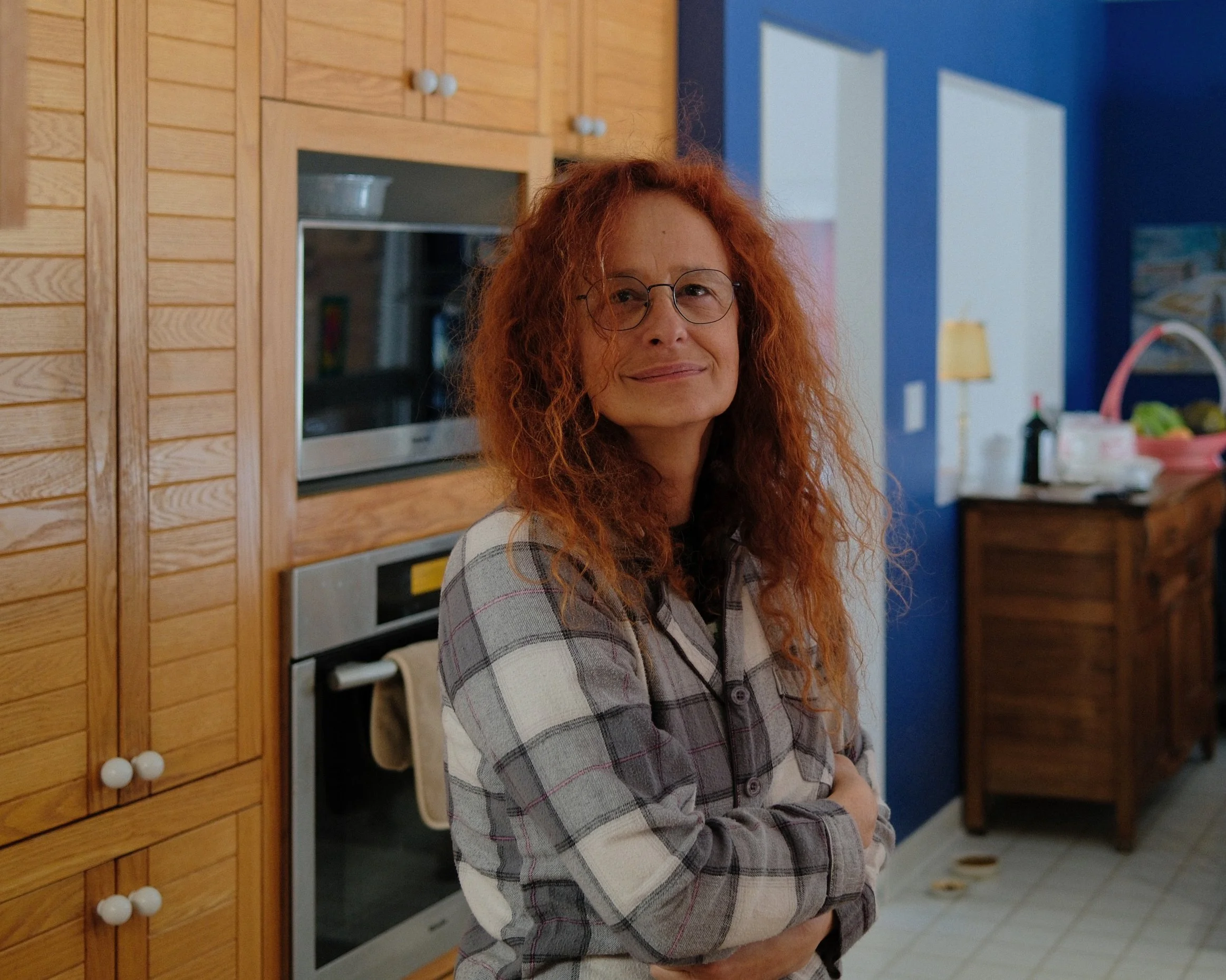
Céline, playing along while I test a recipe in my kitchen.
Under Eight Different Lights
Unlike NS – Céladon, born and tested during a single trip, NS – Bleu de faïence was put through its paces on a set of photos chosen for how different their conditions were: blue-dominated interiors, portraits under lamp or window light, dense late-summer foliage, a close-up on a glass, a color-crowded bookshelf. A less narrative test than a trip, but just as telling.
Skin tones were the first thing to check, and that's where the R –3 / B +3 shift had to prove itself. A portrait taken in a kitchen with deep blue walls, another under lamp light in an armchair, already seen earlier in this post, a third in close-up near a window: three different lighting setups, and in all three, skin stays in a warm, balanced register. Even in the kitchen, where the blue wall could have taken over everything, the subject's complexion in the foreground holds its own.
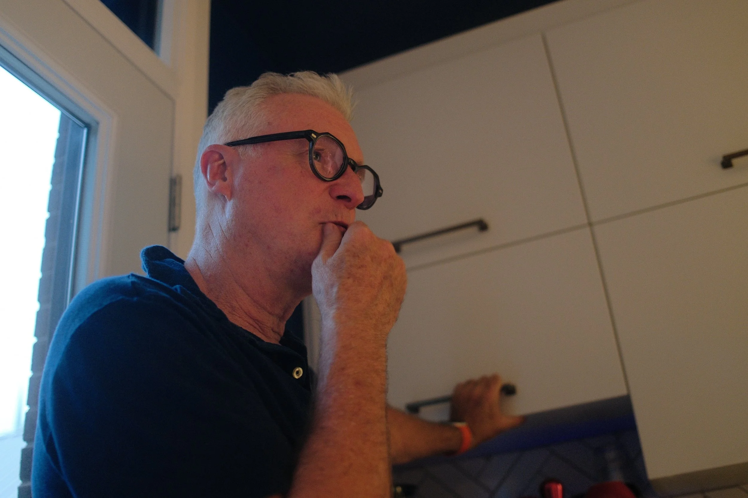
Marco, a moment of reflection, caught in passing.
Summer greens, the most uncertain point in the whole build, were tested on a forest path photographed one overcast afternoon in northern Germany, at Möltenort. Neither the place nor the trip matters here: it's an overcast-afternoon light you find often enough in Quebec, and greens that come close to matching. It's a demanding test: a lot of green, in registers that shift a great deal depending on whether it's in full light or in the shade of the canopy. The result confirms the choice to turn off Color Chrome Effect: the greens stay understated, without swinging toward a harsh yellow in the lit patches or collapsing into an undifferentiated mass in the shade.
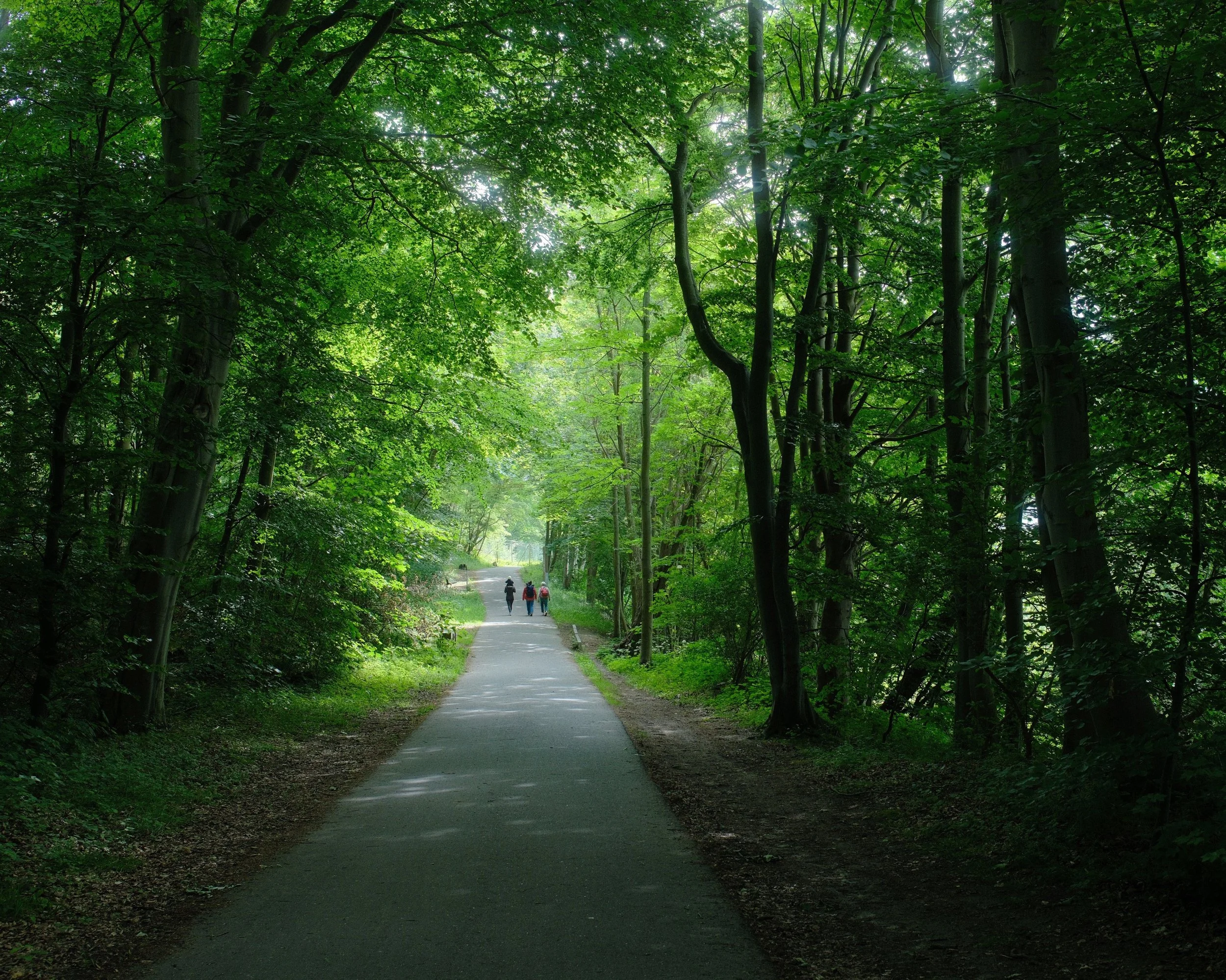
Daria and Leonard, Shirin and Giuseppina, in the distance, on a path in Möltenort.
Whites and beiges were checked on a tram, under a mixed light of fluorescents and natural light through the door. The subject's beige sweater stays neutral, with no yellow or greenish cast, which matches the goal I'd set from the start.
That left blue itself, in its most discreet uses. A close-up glass of white wine, with a blurred blue bottle in the background, shows well what the recipe does with a blue relegated to the bokeh: present, elegant, but never overwhelming. A bookshelf crowded with juxtaposed colors served as a broader test, less tied to the sensitive points, but useful for confirming that the moderate contrast holds even in front of a lot of colors at once.
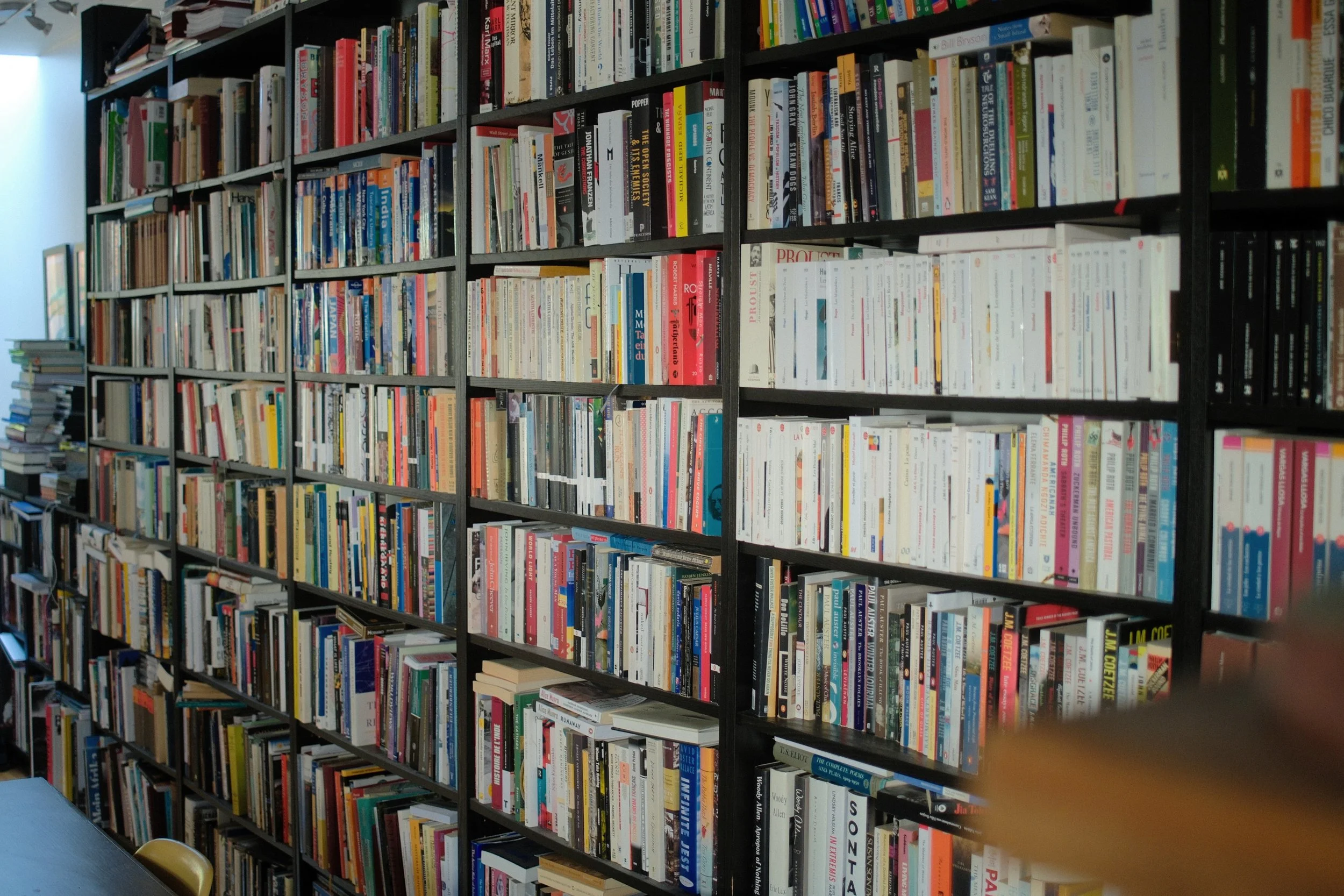
Virginia's bookshelf, where the colors never fight for space.
Two Recipes, One Intuition
NS – Bleu de faïence wasn't born from a trip, but from an assemblage: a door glimpsed in a photo that isn't mine, a white-balance disappointment, eight files shot in contexts that had nothing in common except already being in my catalogue. It's a different way of putting a recipe to the test, less linear than a travel journal, but just as demanding.
This test also confirms an intuition that goes beyond this one recipe. The best-known Fujifilm recipes often lean on primary colors: Velvia pushes reds, greens, and blues hard, Reala Ace goes for general balance. NS – Bleu de faïence, like NS – Céladon before it, seems to lean instead toward secondary colors: turquoises, blue-grays, sea greens, beiges, off-whites. A more understated palette, which may explain why both these recipes hold up so well indoors, where bold colors tend to assert themselves too strongly.
There's no secret formula here: an inspiration, a confrontation with what you already know, corrections, repetition until it holds. If your camera allows for this kind of customization, I'd encourage you to try your own rather than borrowing mine as is.
The NS family now has two recipes. If you try NS – Bleu de faïence or NS – Céladon, I'd be curious to know what they do with your light. A recipe only really exists once it's been tested somewhere other than in the head of the person who designed it, so don't hesitate to stray from it, change a number, and let me know what you get.
- Louis-Martin Ouellet
All photos in this post are SOOC, using the NS – Bleu de faïence settings, except for Najat's photo, taken with an iPhone.