
X-Trans V in Detail - Part 4: Color, Sharpness, Clarity, Noise Reduction
The third post in this series covered settings that act before the simulation even comes into play, or deeper inside the image. This one, the last in the series, returns to settings closer to the surface: four sliders that fine-tune the rendering once everything else is already in place. Color adjusts chromatic intensity. Sharpness and Clarity each work on a different kind of detail, one on edges and the other on midtone texture. And noise reduction protects the image as ISO climbs.
Unlike the previous posts, this one won't rely on before/after comparison photos. The four settings that follow are fine adjustments, whose effect is often too subtle to see clearly on screen without pushing the sliders to extreme values or cropping in tight, which starts to look like a demonstration rather than an honest example.
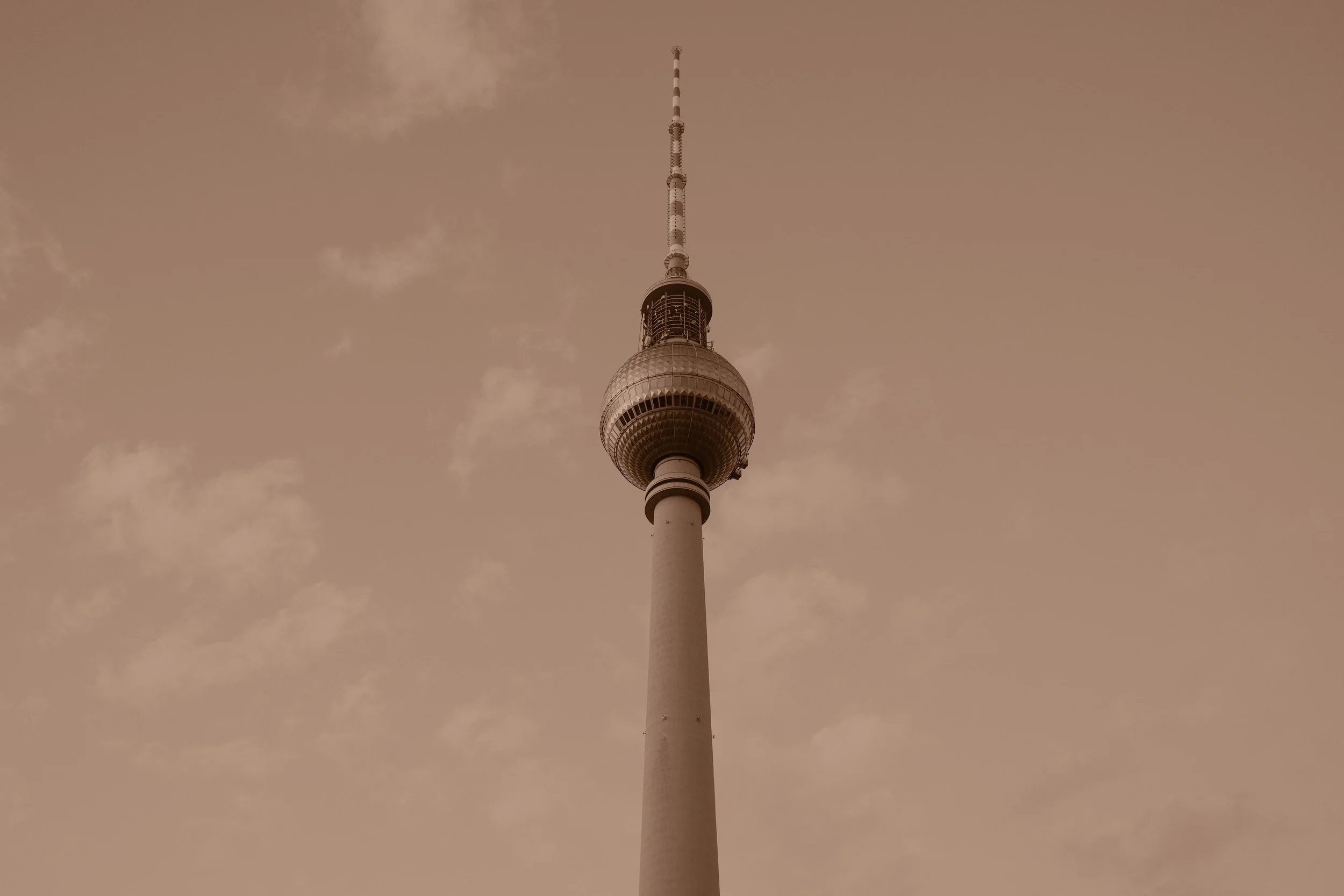
Berlin's Fernsehturm (Sepia base)
The Four Settings
Color
Color is the simplest of the four settings in this post: a slider that increases or decreases saturation, from -4 to +4, in steps of 1. Nothing more, at first glance. But the same +2 doesn't produce the same result depending on the simulation it's applied to. On Provia, already neutral, the effect is clear. On Classic Chrome, designed for a matte look, it lifts a deliberately low saturation without ever reaching Provia's. On Velvia, already the most saturated in the catalog, the same +2 pushes even further a color that was already plenty saturated. Color changes neither the contrast nor the tonal balance native to the simulation: it acts only on chromatic intensity, layered over a base that stays unchanged.
Not to be confused with Color Chrome Effect, covered in the second post of this series : both touch color, but not in the same way. Color Chrome Effect detects areas that are already highly saturated and reintroduces fine tonal gradation there, rather than uniformly adding saturation. Color, on the other hand, works as a simple multiplier, applied everywhere at once.
Like the other settings in this series, Color only affects JPEG, HEIF, or in-camera RAW conversion (in-camera or via X RAW Studio): the native RAW file stays untouched.
Sharpness
Sharpness works like Color: a simple slider, from -4 to +4, that sharpens or softens an image's edges. But contrary to what you might expect, 0 isn't a neutral point where nothing happens. Fujifilm describes the setting as "sharpen or soften outlines": at -4, the image receives active softening, not simply less processing. Several experienced users find the default setting of 0 relatively aggressive, hence a frequent preference for starting around -1 or -2, within a comfortable range up to +2.
Technically, Sharpness combines a classic edge-sharpening mask with a micro-contrast adjustment. In the negative, the rendering softens, closer to a film-like aesthetic, less marked by that digital sharpening you sometimes recognize at a glance. In the positive, edges gain crispness, the image looks more "crunchy," but beyond roughly +2 or +3, halos can appear at high-contrast edges, a treeline against a blue sky, for instance.
One disagreement is worth flagging: Fuji X Weekly claims that at -4, sharpening is essentially disabled. The official manual and several user tests tell a different story: even a lens known for being very sharp produces a visibly softer image at -4, a sign of active softening rather than a simple absence of processing. As with Color, only JPEG, HEIF, or in-camera RAW conversion is affected; native RAW receives a fixed minimum of processing, independent of this slider.
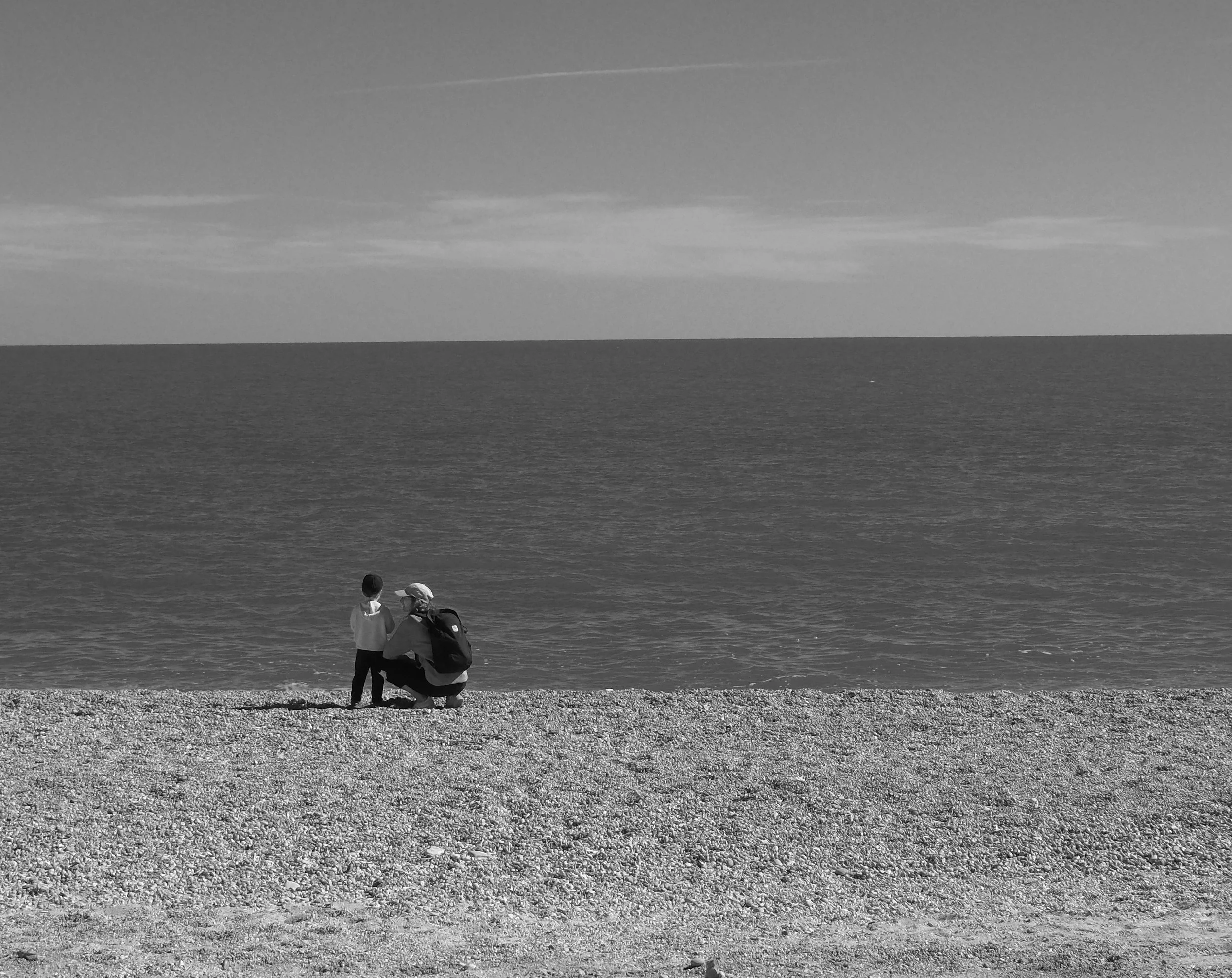
A young German woman and her son in Mattinata (CW - Mono Simple)
Clarity
Clarity is the widest of the four sliders in this post, from -5 to +5, and also the subtlest to understand. The official manual describes it as a way to "increase definition while altering tones in highlights and shadows as little as possible." In other words: it works on midtone micro-contrast, without being a simple synonym for Sharpness.
The difference between the two is worth spelling out. Sharpness acts on edges, through a localized mask along the lines of an image. Clarity works more broadly, on the separation between neighboring tones over a wider area, with a limited but real secondary effect on highlights and shadows. In the positive, the image gains perceived depth, an effect Fuji X Weekly compares at times to a software dehaze, at times to the very defined look of a slide film like Kodachrome 25. In the negative, the image softens, a rendering closer to an optical diffusion filter: around -1/-2, light diffusion; toward -3/-4, moderate diffusion; at -5, strong diffusion.
One detail worth knowing before heading out to shoot, discovered by pal2tech: Sharpness, even at +4, has no effect on memory card write speed, while Clarity, as soon as it moves off zero in either direction, noticeably slows down recording, regardless of the format chosen (JPEG, JPEG+RAW, or RAW only). A longer "Storing" pause after each shot, a trade-off worth knowing if you shoot quickly. Fujifilm actually recommended, when the setting was introduced, leaving it at 0 while shooting and applying it afterward instead, through in-camera RAW conversion or X Raw Studio.
Common use: slightly negative Clarity (-1 to -3) softens skin in portraiture without blurring the image; a positive value instead strengthens texture and perceived depth in landscape or street photography. Like the other three settings in this post, Clarity only affects JPEG or HEIF: the native RAW file keeps no trace of it.
Noise Reduction
High ISO NR is the last of the four settings in this post, a slider from -4 to +4 that replaced, starting with the X-T4 and X-Processor 4, the earlier setting simply called "Noise Reduction." High values: more noise reduction, but also more edge smoothing. Low values: more detail preserved, but also more visible noise.
One thing to understand before adjusting this slider: processing intensifies automatically with the ISO in use, an already-rising curve that the chosen value only modulates. There's no position that fully disables it, even at -4. The trade-off stays the same at every level: more reduction gives a cleaner image, but at the cost of a sometimes "waxy" or smeared look at high settings, visible from ISO 3200-6400 and pronounced beyond 12800, exactly the range where the effect would deserve to be shown rather than described.
Recommendations converge toward the low end of the scale. Fuji X Weekly prefers staying between -4 and -2, with a clear preference for -4 or -3. pal2tech, testing at ISO 12800 and 51200, advises never exceeding +1, +2 at most, with +3 and +4 causing noticeable detail loss from ISO 3200 onward. No source recommends strongly positive values. Like the other three settings in this post, High ISO NR only affects JPEG or HEIF: the RAW file is recorded without it.
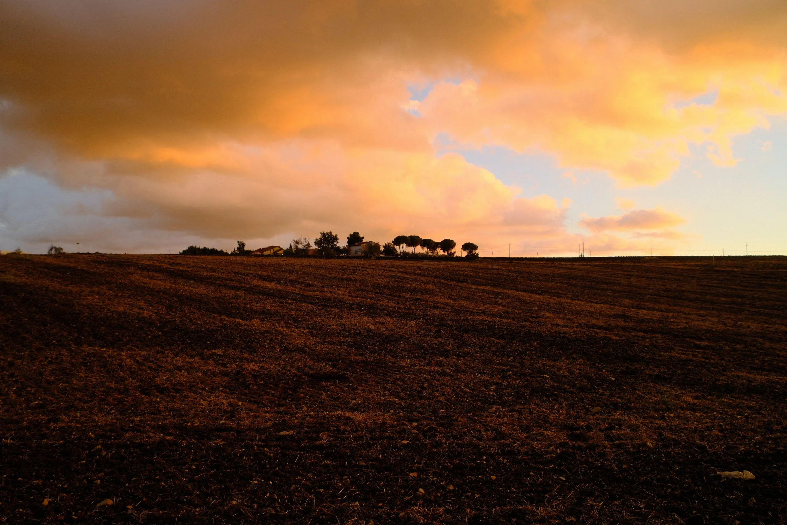
La Casetta, our vacation home in San Bartolomeo in Galdo (NS - Persimmon)
Going Further
Color adjusts chromatic intensity. Sharpness and Clarity each work on a different kind of detail, one on edges, the other on midtone texture. Noise reduction protects the image as ISO climbs. Four settings more discreet than those in the earlier posts, but that make all the difference in a recipe's final rendering.
This series on the X-Trans V processor comes to a close here. Twenty film simulations, three settings that enrich them, three more that work deeper, and these last four that fine-tune the result: a complete palette, from choosing a simulation to the final adjustment. Understanding what each setting actually does remains the best way to build a recipe that holds together, rather than stacking numbers without knowing why.
— Louis-Martin Ouellet
This blog's ten recipes — the seven CW and the three NS — all live in the Recipe Cellar, a space where they simply wait to be discovered.