
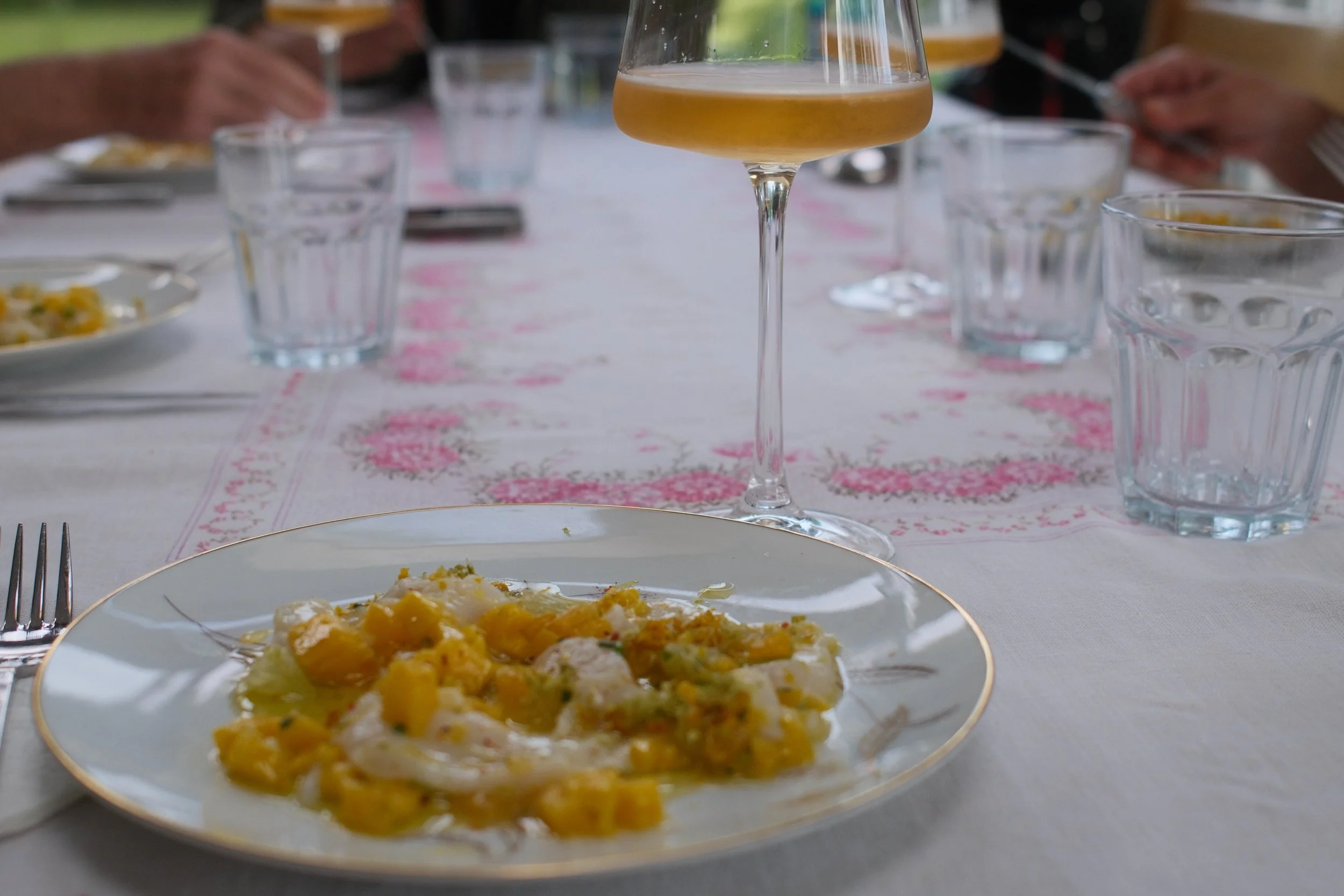
Scallops, mango, and the D18 (Settings: CW - Typ 113)
1. Two Yellows on the Same Table
The starting inspiration
The wine is called D18. Olivier Pithon raises it in Calce, a village in the Agly, in France. Its color runs golden and hazy, unclarified. In the same photo, beside the glass, a scallop and mango crudo carries that same yellow, in a different register. Two yellows, one photo, and a question that ended up taking precedence over the meal itself: could a Fujifilm recipe carry that kind of energy?
(Answering that question meant questioning a rule I had never broken.)
2. A Rule I Had Never Broken
Choosing Classic Chrome, and a craft other than ceramics
There's a rule on this blog I had never yet broken: neither CW nor NS uses Classic Chrome, Fujifilm's most widespread simulation, the one found in the majority of recipes circulating online. That was deliberate, as I already wrote in the afterword : a simulation that common risks becoming a reflex rather than a choice. CW, the foundation of the whole series, doesn't use it, and NS has followed that same logic until now. NS – Giallo de Calce is the first exception.
It's the fifth recipe in the NS family, and the four before it all borrowed their names from ceramics: the green of Céladon, the blue of faïence, the orange of Persimmon, the red of Jihong. NS – Giallo de Calce borrows from another craft instead. A wine's color has nothing to envy in a glaze: it carries a color just as precise, just as capable of telling a story, of a winemaker's work rather than a potter's.
One clarification before going further: when I mention "photos" used to test an idea, I mean RAF files taken spontaneously from my catalog, or during an improvised outing to confirm a specific point while a recipe was taking shape, never sessions staged for the occasion.
(What remained was figuring out how to actually build that desired energy, setting by setting.)
3. Starting From a Hunch
Eterna Bleach Bypass
Eterna Bleach Bypass is normally a cold, desaturated simulation, another one that hadn't appeared in any of my recipes until now. I took it against the grain: an almost neutral canvas on which a single family of colors would keep vibrating, rather than an image that's colorful throughout. First set of settings: Color at +3, Color Chrome Effect on Strong, a white balance shift of R+2/B−3 so the yellow would lean toward gold rather than lemon.
A second, more pushed version followed: Color at +4, the shift tightened to R+2/B−4, Highlights at −2 to protect the scallop's whites, Clarity at −1 for a soft image. Across a first series of ten photos, I leaned toward a version with Clarity brought back to 0.
(What remained was seeing whether this base could be pushed further still.)
4. Testing a More Radical Path, and Abandoning It
The R+1/B−5 shift
The next hypothesis was that the wine's color would carry more energy with an even sharper shift, R+1/B−5 rather than R+2/B−4. Four pairs of photos compared the two settings on the same scenes: yellow against a brick wall, a portrait in a blue dress, end-of-day flowers. The difference was real but subtle, not clear enough to justify moving further from the neutral center, with an increased risk to skin tones. R+2/B−4 remained the chosen setting.
(The shift wasn't the only lever available for pushing saturation further.)
5. Recognizing a Technical Limit
The question of saturation, settled
Another path closed on its own. Color and Color Chrome Effect were already at their maximum, +4 and Strong. No Fujifilm camera of this generation offers a further step, and there's no per-hue HSL setting in SOOC mode to isolate yellow from the other colors. The only lever left was the white balance shift already being tested, or shooting technique itself, a slight underexposure targeted at the yellow subject. Saturation, as a tool, had reached its limit.
(Technically, there was nothing left to add. What remained was finding out whether it was enough.)
6. The Ceiling Reached, and Still Not Enough
That's where the real problem lay
Even at the simulation's technical ceiling, with nothing left to add on any front, the result didn't carry the energy I was after in the wine's color or the mango's flesh. Eterna Bleach Bypass had nothing more to give, and it wasn't enough.
(It meant changing simulations, not just adjusting the sliders.)
7. Changing Simulations
Classic Chrome
Classic Chrome took over, with markedly more moderate settings: Color Chrome Effect brought down to Weak, Color at just +2. On the same files already reprocessed under Eterna Bleach Bypass, the comparison left no doubt. The mango's yellow and the wine gained richness rather than raw intensity, the brick wall and the hydrangea regained a legibility the earlier version had crushed, and the skin tones, a concern from the start, were markedly more natural. The Eterna Bleach Bypass path produced nothing directly usable, but it was that path, pushed to its ceiling, that made visible what Classic Chrome could offer with far less effort.
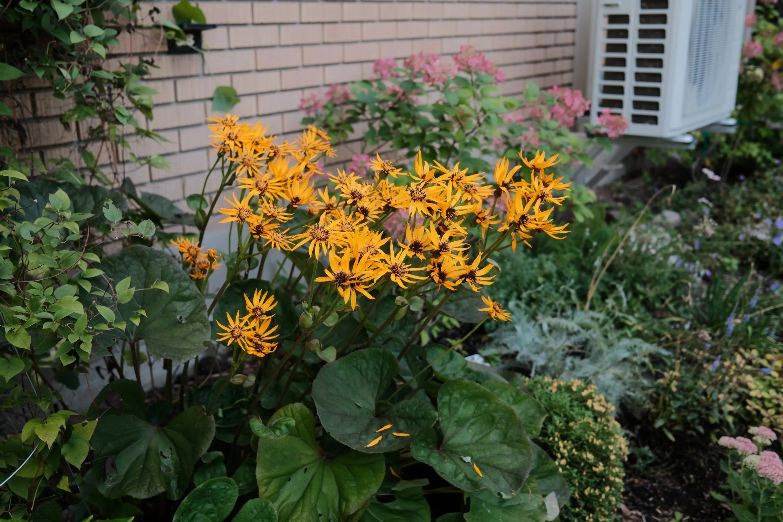
Photo-test 1
(With the simulation chosen, what remained was calibrating the rest of the recipe around it.)
8. Choosing a Dynamic Range
DR400
Dynamic range remained. DR400 requires a minimum ISO of 500, double DR200's, in exchange for two stops of headroom in the highlights rather than one, exactly what was needed to protect the yellow's density without letting it blow out. The trade-off: a bit more baseline noise, even in ample light where a lower ISO would have sufficed under a different setting.
(With dynamic range settled, white balance remained, the most delicate point of the whole process.)
9. Living With a Tension
White Balance
A fixed Daylight balance, my usual choice for keeping a constant character from one scene to the next, turned orange under the tungsten lighting of an evening kitchen. Switching to Auto Ambiance Priority solved the problem, but went back on a principle established with NS – Jihong: a fixed balance so the chromatic character wouldn't vary from scene to scene. I settled on Auto Ambiance Priority because in natural light, outdoors or near a window, that mode behaves essentially like any automatic setting (I explain this distinction between the automatic modes in the post on white balance, tones, and dynamic range on the X-Trans V sensor). The consistency I wanted for most of the intended uses wasn't sacrificed, then; only indoor artificial lighting behaves differently.
That doesn't make Auto Ambiance Priority an autopilot. A +1/3 EV correction is still sometimes the right call indoors, depending on the scene, and it's worth training the eye to spot it before pressing the shutter. When that instinct is missing in the moment, reworking the RAF file afterward with X Raw Studio remains an option.
(The recipe was now complete on paper. What remained was putting it to the test in the field.)
10. Putting the Chromatic Hierarchy to the Test
Full sun, then the missing test
Seven photos taken around noon, in full sun, with the complete recipe dialed in: people at a picnic table, the front of a potato shack, potted flowers, garden decorations. Not a single clear-yellow subject in the lot, which says a lot about how improvised the process was rather than planned in advance. The general behavior holds: a clean blue sky with no cyan shift, protected highlights, measured greens with no cast. But the recipe's central goal, yellow as protagonist, still needed checking under the harshest conditions: midday full sun.
Five photos filled that gap: a small flower isolated on a log, rudbeckias straddling sun and shade within the same frame, a cinquefoil in filtered light, yellow and orange marigolds in full sun. The most revealing test, the marigolds, shows yellows and oranges that are rich and clearly distinct from one another, with no washing-out or blending under harsh light, while the soil stays neutral, with no competing color. The rudbeckias, straddling both kinds of light in the same frame, keep that same warm, dense yellow from one side to the other, while the surrounding greens recede as intended.
This time, the loop left open by the previous test closes: the hierarchy holds, in full sun as in shade.
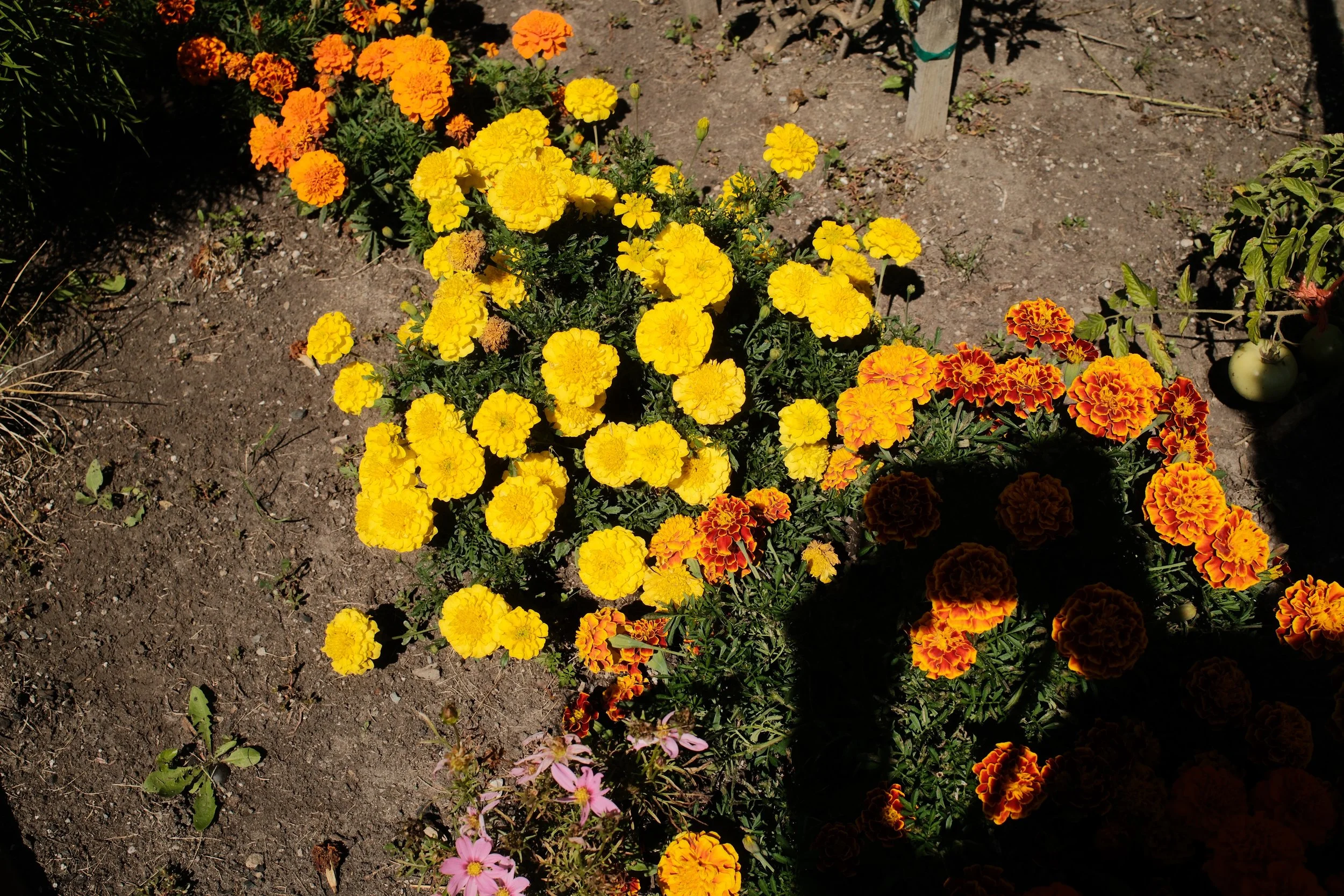
Photo-test 2
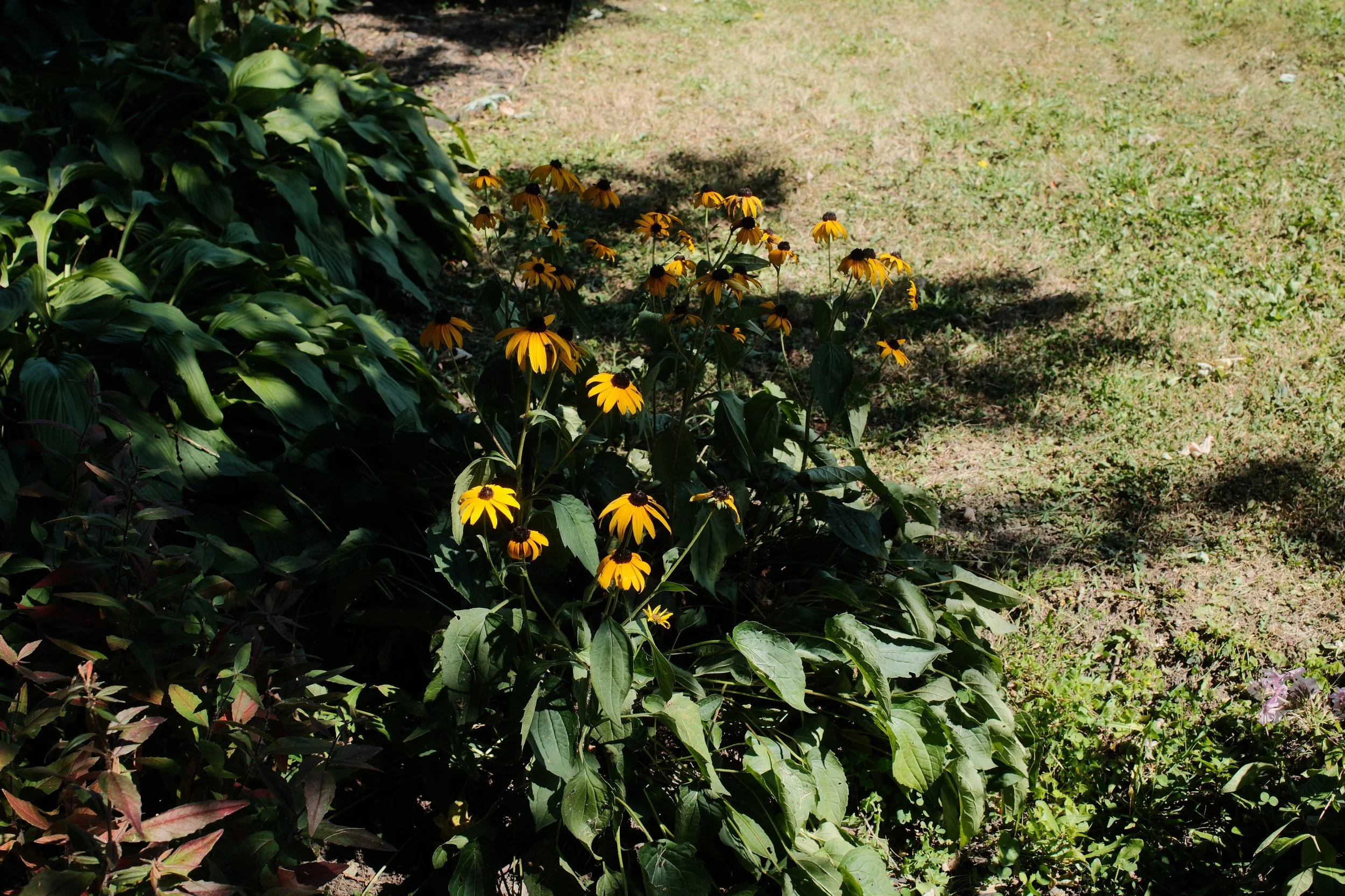
Photo-test 3
(One sensitive point remained to check before considering the recipe finished: faces.)
11. Checking Skin Tones
The file originally planned for this test, the same table as the crudo, with people in the frame, wasn't used in the end. A richer set turned up along the way: eight photos from a trip to Italy and family scenes, several people, several generations, several kinds of light. The point to check remained the same from the start: a shift as strong as R+2/B−4 could pull skin toward an unflattering yellow-green.
The most successful skin tones appeared at golden hour, several skin tones within the same frame, with warmth that was measured rather than excessive. Scenes in hazy daylight or window light stayed just as natural. The risk tracked from the start of the process didn't bear out on this expanded sample, wider than what had originally been planned.
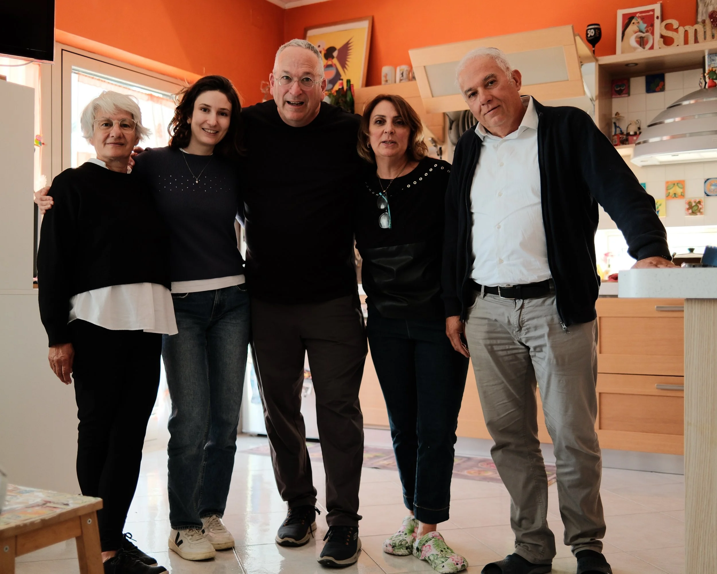
Gathering in a kitchen in Benevento, Campania. (Photo by Davide Di Fede, taken with my X100vi)
(The recipe held. What remained was giving it a name.)
12. Naming the Recipe
Calce, Olivier Pithon, and Luigi Moio
The name carries two winemakers. "Giallo" comes from Giallo d'Arles, a Greco di Tufo raised by Luigi Moio at Quintodecimo, in Campania. Its golden color with amber highlights comes from a clarification he refuses and a partial aging in new oak barrels, and the name itself pays homage to the yellow Van Gogh loved so much during his stay in Arles. "de Calce" comes from the village where Olivier Pithon makes his D18, in the Agly, in Roussillon, the wine that visually inspired the recipe from the start. In Italian, calce also means lime, the mineral white of Mediterranean walls. A happy doubling of meaning, not the source of the name.
Two winemakers, two plots, not two mass producers. That's a thread I've been pulling since the very first post on this blog, where I explained that I prefer wines from winemakers who know every row of their plot over producers chasing volume, and where I compared this site itself to a cellar, the place where I keep things like this. The Recipe Cellar, the page that now brings together the blog's twelve recipes, was born from that same line of thinking. NS – Giallo de Calce closes a loop that was open even before the first recipe.
(This loop isn't just a narrative one; it can also be counted in recipes.)
13. Twelve Recipes, a Film Photographer's Measure
Tallying up, with the five NS colors
With NS – Giallo de Calce, the NS family now counts five recipes, each built around a color: the green of Céladon, the blue of faïence, the orange of Persimmon, the red of Jihong, and now yellow. With the seven CW recipes, that makes twelve. It's roughly what a film photographer used to carry in different rolls at once: a number large enough to answer to almost any light, and small enough that none of them would become a reflex rather than a choice.
(What remained was closing the post where it had begun: at the table.)
14. Back to the Table
The crudo returned, this time reworked with the recipe now fixed. The mango keeps its golden orange, the scallop stays white, the fennel's green and the chili's red stay understated, the stem of the wine glass blurs softly into the background. The hierarchy sought from the start, a protagonist yellow and a quiet rest, is there.
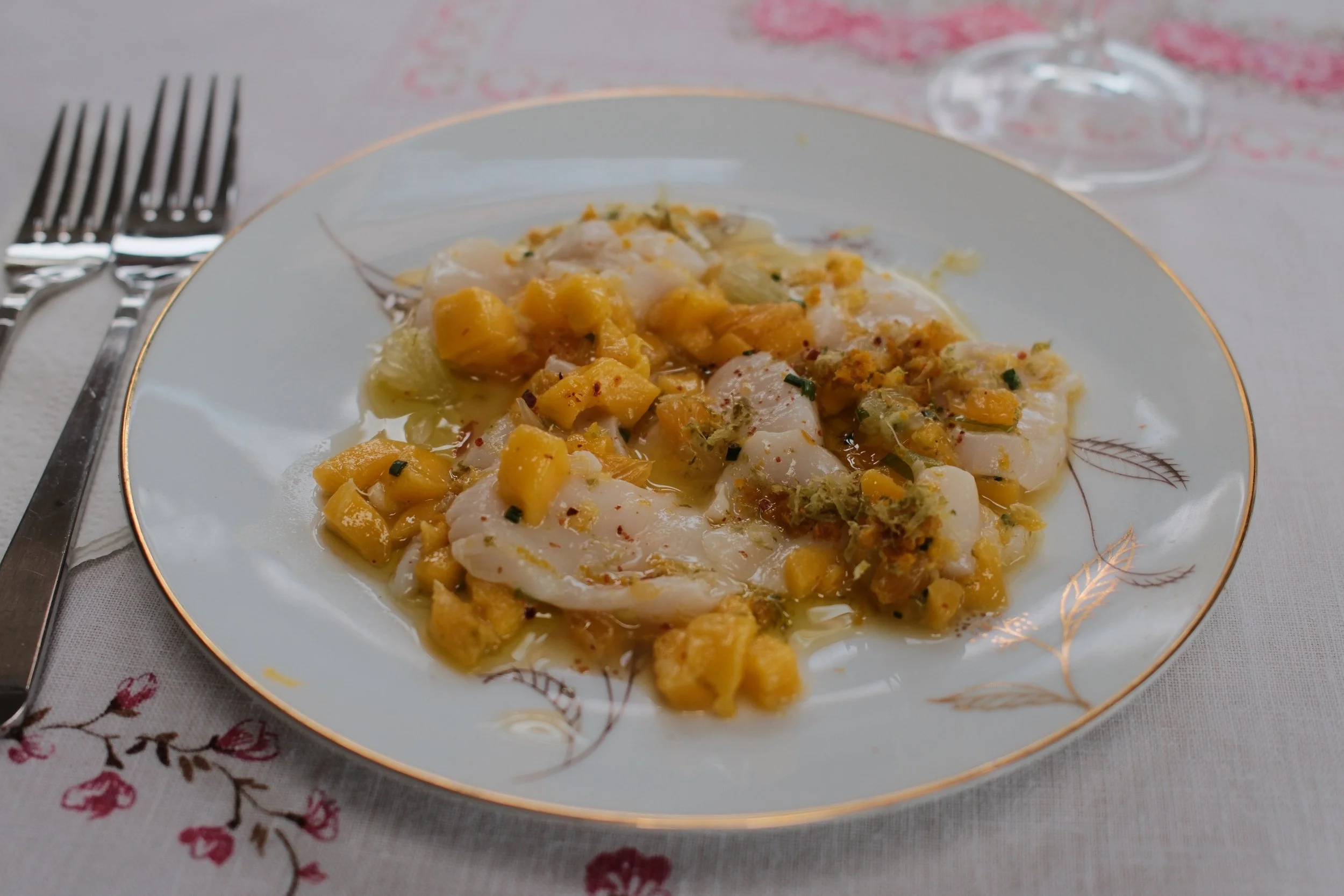
Scallop and mango starter, enhanced with NS – Giallo de Calce.
This recipe, like this post, was conceived first to document every step of its making, more than to arrive at one precise result. Here it is, laid out simply:
| Setting | Value |
| Film Simulation | Classic Chrome |
| Dynamic Range | DR400 |
| ISO | 500 to 3200 |
| White Balance | Auto Ambiance Priority |
| WB Shift | R +2 / B −4 |
| Color | +2 |
| Color Chrome Effect | Weak |
| Color Chrome FX Blue | Off |
| Highlights | −2 |
| Shadows | +1 |
| Sharpness | −1 |
| Clarity | 0 |
| Noise Reduction | −3 |
| Grain Effect | Off |
| Exposure Compensation | 0 EV, indoors and outdoors (see section 9 for the nuance) |
(Tested with a K&F Black Mist 1/8 filter mounted on the lens. Without that filter, it would be a good exercise to play with your own X-Trans V's settings to get close to a look similar to the photos in this post; my earlier posts on the subject surely contain enough clues to get there.)
If this process has been useful to you, or if it's made you want to experiment starting from this recipe, tell me. That's mostly what interests me, not so much the result you'll get, but whether the journey will have shed some light on your own.
— Louis-Martin Ouellet
Unless noted, every photo in this post is SOOC: NS – Giallo de Calce settings.. The blog's twelve recipes — the seven CW and the five NS — all live in the Recipe Cellar, a space where they simply wait to be discovered.